
Getting Started
Download Data and Worksheet
Go to this url and download the zipped file of today’s data and worksheet. Move it to your desktop where you can easily find it again. Right click on the zipped file and extract the contents (Windows) or double-click to open (MacOS).
R and RStudio
R is the programming language. RStudio is an integrated development environment (IDE) that makes scripting in R much easier. Both are free and open source software. If you’d like to continue experimenting with R and RStudio, but you’d rather not install them on your personal machine, you can instead use the https://apps.rutgers.edu cloud service.
When you launch RStudio, you’ll notice the default panes:
- Console (lower left, with the
>prompt) - Environment/history (tabbed, in upper right)
- Files/plots/packages/help (tabbed, in lower right).
R Markdown
A script written in R is customarily stored in a plain text file with the .R extention. But this is an R Markdown document, and instead has the file extension .Rmd. It weaves together code chunks, delineated by three back ticks, together with explanatory text. Markdown is a simple formatting syntax for authoring documents. Why bother learning it? The same markdown document can produce a variety of presentation outputs (e.g. HTML, PDF, MS Word). For more details on using R Markdown see http://rmarkdown.rstudio.com.
Quick and Dirty Intro to R
Why program?
- You understand more deeply what computers do to your data. By understanding the workings of an algorithm, you can better justify your claims as well as understand the ways algorithms may distort the data.
- The work of data analysis becomes transparent. Since we’re writing code, we can trace the steps we made to make something.
- We start to correct for the problem of tools shaping research questions. In other words, we build the tool to fit our questions.
Values
The simplest kind of expression is a value. A value is usually a number or a character string.
Click the green arrow to run the following code chunk; or, place your cursor next to the value and click Ctrl + enter (PC) or Cmd + return (Mac) to get R to evaluate the line of code. As you will see, R simply parrots the value back to you.
6Variables
A variable is a holder for a value.
msg <- "Happy Thanksgiving!"
print(msg)
print("msg") # what do the quotes change?
Assignment
In R, <- stores a value under a name which you can refer to later. In the example above, we assigned the value “Happy Thanksgiving!” to the variable msg. What do you think will happen in this example?
a <- 10
b <- 20
a <- b
print(a)
Functions
R has a number of built in functions that map inputs to outputs. Here’s a simple example using the sum() and c()functions. To get help on these functions, type ?sum() or ?c() at the console.
sum(c(10,20,30))Workflows
Now let’s make sure you’re working in an appropriate directory on your computer. Enter getwd() in the Console to see current working directory or, in RStudio, this is displayed in the bar at the top of Console.
In RStudio, go to Session > Set Working Directory > Choose Directory > [folder you saved to your Desktop].
Manipulating and Analyzing Tweets about Sound Archives
Introduction/Review of Tweet Data
Let’s spend some time looking at the JSON representation of a sample tweet, which you can access here. Next, let’s examine Twitter’s User Data Dictionary to examine the field names with their defintions. Having a familiarity with these fields will help you to develop your research questions.
Load Packages and Data
We’ll start by loading the tidyverse package, which includes a set of helpful packages for data manipulation and visualization. Dplyr, for instance, makes data manipulation in R fast and relatively easy. For help with dplyr, type help(package=dplyr) at the console. If any package isn’t yet installed on your system, use the install.packages() function to get it.
Next, we’ll assign our Twitter datasets to two data frames so that we can manipulate them in the R environment. A data frame is a compound data type composed of variables (column headers) and observations (rows). Data frames can hold variables of different kinds, such as character data (the text of tweets), quantitative data (retweet counts), and categorical information (en, es, fr).
About the datasets: the British Library Sounds and Ubuweb datasets were created for a research project investigating tweets about digital sound. British Library Sounds has 90,000 digital recordings of speech, music, wildlife and the environment. Ubuweb specializes in avant-garde sound and film, including poetry readings, conceptual art, ethnopoetic sound, lectures, documentaries, and sound ephemera.
# install.packages("tidyverse")
library(tidyverse)

bls <- read.delim("data/bls.tsv", sep = "\t", encoding = "UTF-8", quote = "", header = TRUE, stringsAsFactors = FALSE)
ubu <- read.delim("data/ubuweb.tsv", sep = "\t", encoding = "UTF-8", quote = "", header = TRUE, stringsAsFactors = FALSE)
Finally, let’s get an overview of your data frame with str(), which displays the structure of an object.
str(bls) # structure of British Library Sounds data frameR doesn’t really intuit data types, as you may have noticed when you ran the str() function on the British Library Sounds tweets. You have to explicitly tell it the data type of your variable. In this case, we’re going to use the values of the time column to create a brand new column called
timestamp with a properly formated date and time that R will recognize. Note that we need to specify the time zone as well.
Notice how we specify a single variable from a data frame by using the dollar sign ($).
bls$timestamp <- as.POSIXct(bls$time, format= "%d/%m/%Y %H:%M:%S", tz="GMT")
ubu$timestamp <- as.POSIXct(ubu$time, format= "%d/%m/%Y %H:%M:%S", tz="GMT")
Subscripting
An R data frame is a special case of a list, which is used to hold just about anything. How does one access parts of that list? Choose an element or elements from a list with []. Sequences are denoted with a colon (:).
bls$text[1] # the first tweet

bls$text[2:11] # tweets 2 through 11
You may have noticed some duplicate tweets in the dataset (Are they retweets or duplicates? How can you tell?). That dirties our data a bit, so let’s get rid of those. The way we do this is with the id_str value. Remember that Twitter assigns a unique identifier to each and every tweet? A quick way to determine if we have any duplicates in our dataset is to see if any id_str
values are repeated.
# how many rows in our dataset?
nrow(bls)
## [1] 10350# how many of those tweets are duplicates?
nrow(bls) - length(unique(bls$id_str))## [1] 2955# remove those dups
bls_dedup <- subset(bls, !duplicated(bls$id_str))
ubu_dedup <- subset(ubu, !duplicated(ubu$id_str))Select
The next several functions we’ll examine are data manipulation verbs that belong to the dplyr package. How about some basic descriptive statistics? We can select which columns we want by putting the name of the column in the select() function. Here we pick two columns.
Dplyr imports the pipe operator %>% from the magrittr package. This operator allows you to pipe the output from one function to the input of another function. It is truly a girl’s best friend.
View invokes a spreadsheet-style data viewer. Very handy for debugging your work!
bls_dedup %>%
  select(from_user, timestamp) %>% View
Arrange
We can sort them by number of followers with arrange(). We’ll add the desc() function, since it’s more likely we’re interested in the users with the most followers.
What do you notice about the repeated from_user values?
bls_dedup %>%
  select(from_user, user_followers_count) %>%
  arrange(desc(user_followers_count)) %>% View
Question: How would you select the Twitter user account names and their number of friends, and arrange them in descending order of number of friends? What is the difference between a follower and a friend? Check back with the User Data Dictionary if necessary.
Group by and summarize
Notice that arrange() sorted our entire dataframe in ascending (or descending) order. What if we wanted to calculate the total number of tweets by user account name? We can solve this kind of problem with what Hadley Wickham calls the “split-apply-combine” pattern of data analysis. Think of it this way. First we can split the big data frame into separate data frames, one for each user name. Then we can apply our logic to get the results we want; in this case, that means counting the tweets per user name. We might also want to get just the top ten rows with the highest number of tweets. Then we can combine those split apart data frames into a new data frame.
Observe how this works. If we want to get a list of the top 10 tweeters, we can use the following code. We’ll load the knitr package so we can use the kable() function to print a simple table.
# install.packages("knitr")
library(knitr)

bls_dedup %>%
  select(from_user) %>%
  group_by(from_user) %>%
  summarize(n=n()) %>%
  arrange(desc(n)) %>%
  top_n(10, n) %>%
  kable()
One might reasonably assume, without probing its collections, that British Library Sounds is primarily a UK national concern. Can we get a sense of how many of the users in this dataset are English speakers? How important are other user languages?
Question: Can we use select(), group_by(), summarize(), and arrange() to figure out how many tweets there are by user language?
Mutate
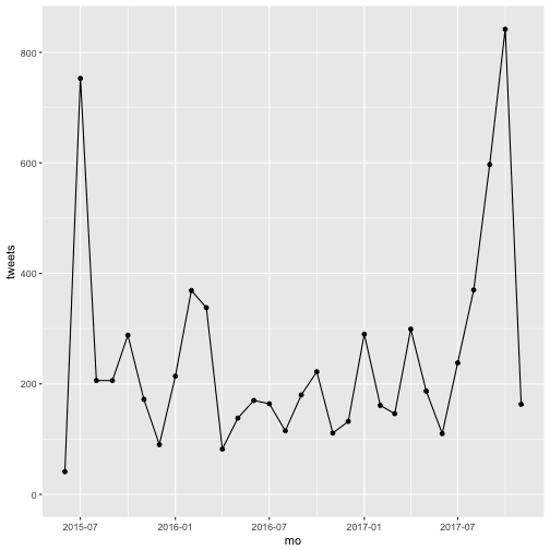
The mutate() function lets us create new columns out of existing columns. The timestamp column indicates the time of the tweet down to the second. This level of granularity might make it computationally intensive if we wanted to plot tweets over time, depending on the number of observations in our dataframe. To make that process more efficient, we will create a new column called mo in which we round the timestamp down to the month using the floor_date() function of the lubridate package. Then we’ll use group_by() and summarize() to count the number of tweets per month Finally, we’ll use another Wickam package, ggplot2, to plot the total tweets by month.
So what does that tweet volume over time look like?
# install.packages(c("ggplot2", "lubridate"))
library(ggplot2)
library(lubridate)

# assign our modified data frame to the `bls_clean` object
bls_clean <- bls_dedup %>%
  select(timestamp) %>%
  mutate(mo = floor_date(timestamp, "month")) %>%
  group_by(mo) %>%
  summarize(tweets = n())

# plot it using ggplot2
ggplot(bls_clean, aes(x=mo, y=tweets)) + geom_point() + geom_line()
Cool. But how many of those are retweets? Here, we’re going to load the stringr package to perform operations on character strings (reminder: type help(package="stringr")at the console to get help on this package).
We’ll use the str_detect() function to see if there is a RT string at the beginning of the text of the tweet. str_detect() returns a Boolean TRUE or FALSE value. In this way, it doesn’t matter if there are one or two RTs in the text of the tweet, as would be the case for a retweet of a retweet. We’re just detecting if it’s there at the beginning or not.
Next, we’ll use mutate() to count the number of times str_detect() returns a value of TRUE, and we’ll round to the nearest day using floor_date().
# install.packages("stringr")
library(stringr)

bls_dedup %>%
  select(text, timestamp) %>%
  mutate(rt.count = str_detect(text, regex("^RT")),
         day = floor_date(timestamp, "day")) %>%
  group_by(day) %>%
  summarize(retweets = sum(rt.count==TRUE)) %>% View
Filter
To keep certain rows, and dump others, we pass the filter() function, which creates a vector of TRUE and FALSE values, one for each row. The most common way to do that is to use a comparison operator on a column of the data. In this case, we’ll use the is.na() function, which itself returns a response of TRUE for the rows where the in_reply_to_user_id_str column is empty (and FALSE for where it’s filled). But we’ll precede it with the! character, which means “is not equal to.” In human language, what we’re asking R to do is filter, or return, only those rows where in_reply_to_user_id_str is filled with a value, and drop the ones where it is empty.
The question we’ll explore here: how many of those tweets are direct replies to some other user’s tweet (meaning the text of the tweet begins with the @ character)?
bls_dedup %>%
  filter(!is.na(in_reply_to_user_id_str)) %>%
  select(in_reply_to_screen_name, timestamp) %>%
  mutate(day = floor_date(timestamp, "day")) %>%
  group_by(day, in_reply_to_screen_name) %>%
  summarize(replies = n()) %>% View
Question: How can we modify the code above to return the top 10 Twitter accounts that received direct replies in the dataset? Hint: we’ll use the arrange() and top_n() functions, and we’ll drop the timestamp column, since we don’t care when the replies were made. What does this information tell us about our dataset?
Question: How could we use the dplyr verbs we just learned to figure out which users have more followers than people they follow (a rough indicator of influence)? You might want to make use of some statistical summaries, like mean(), median(), or max().
Exploratory Visualizations
One might ask, for example, what kind of conversations, if any, are taking place in the British Library Sounds dataset? The Ubuweb dataset? Is it mostly just people tweeting into the void, or retweeting other user’s tweets? Or are people having actual conversations? In this code chunk, we will plot retweets, replies, and original tweets together over time.
Here we’ll start making more use of the ggplot2 library for plotting using the grammar of graphics. You will find the ggplot2 documentation and R Graph Catalog helpful.
The grammar of graphics says that variables in our data can be mapped to aesthetics in a visualization. Variables, in the case of R, refer to a column in a data frame. The aesthetic in ggplot2 takes many forms including x and y position, size, color, fill, shape, and so on. ggplot2 lets us set which variables are mapped onto which glyphs using the aes() function.
ggplot2 expects three main parts:
- Mapping a dataset to a
ggplotobject by passing the dataset toggplot()as the first argument. - The variables mapped to aesthetics, using the
aes()function. Often,aes()is passed as the second argument but can also be applied to specific geoms, which is what we do in the following plot to get separate lines (geom_line) for retweets, replies, and original tweets. - At least one glyph specified by one of the geoms (in the following plot, we map the same variable to the x axis for all three lines, so we assign it only once, in the
ggplot()function, but then eachgeom_line()contains a different variable mapped to the y axis).
# assign modified data frame to `tweet_type` object
tweet_type <- bls_dedup %>%
  select(text, timestamp) %>%
  mutate(mo = floor_date(timestamp, "month"),
         rts = str_detect(text, regex("^RT")),
         replies = str_detect(text, regex("^@")),
         original = !str_detect(text, regex("^(RT|@)"))) %>%
  group_by(mo) %>%
  summarize(rts_count = sum(rts==TRUE),
            replies_count = sum(replies==TRUE),
            orig_count = sum(original==TRUE))

# make a line plot
p <- ggplot(tweet_type, aes(x = mo)) +
  geom_line(aes(y=rts_count), linetype="dashed", color="red") +
  geom_line(aes(y=replies_count), linetype="dotdash", color="blue") +
  geom_line(aes(y=orig_count), linetype="twodash", color="black") +
  theme_minimal() +
  labs(x="", y="tweets", title="British Library Sound retweets, original tweets, and replies")

p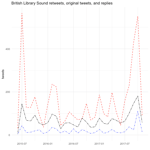
# save an image to file
ggsave(paste0("tweets-timeseries.png"),
       p, width = 7, height = 5)
What would it take to recreate the same plot, but this time with the Ubuweb tweets?
We can make our plot interactive using the plotly package. This will allow us to hover over the lines to see just how many retweets and replies there are each minute.
# install.packages("plotly")
library(plotly)

ggplotly(p)
It seems like things get a bit more interesting later in 2017 (and earlier in 2015). And when we were counting retweets, you may have noticed that October 24, 2017 was a big day. What was so popular?
# filter the dataset to include tweets from one week in late October
bls_dedup %>%
  filter(timestamp >= as.POSIXlt("2017-10-23 00:00:00", tz="GMT"),
         timestamp < as.POSIXlt("2017-10-30 00:00:00", tz="GMT")) %>%
  select(text,timestamp,from_user) %>%
  group_by(text) %>%
  summarize(retweeted = n()) %>%
  arrange(desc(retweeted)) %>%
  top_n(10, retweeted) %>% View
More plots
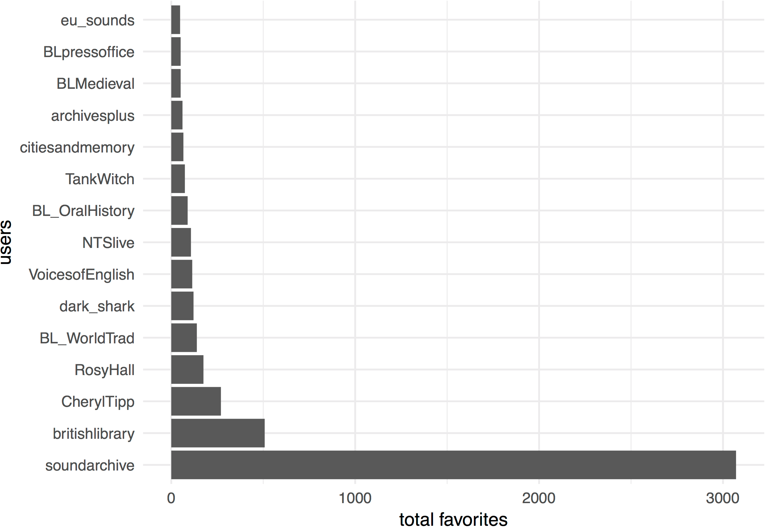
In order to get a bit more experience with ggplot2, let’s join our existing data with some more variables. The -modified.csv datasets will add columns for user_location, retweet_count, and favorite_count. And yes, it would be nice to get one’s data collection right the first time, but realities…
We’ll use the left_join() function from the dplyr library to join the two datasets together. Get help on this function by typing ?left_join() at the console. A left join lets us keep all the rows from our first dataset, and all the columns from the first and second dataset. We don’t have values for user_location, retweet_count, and favorite_count for each and every row (tweet), so this operation will add some NAs to our dataframe.
After joining and cleaning up our datasets, we’ll create an object called faves that counts the total number of favorited tweets by user account in the British Library Sounds tweets.
bls_modified <- read.csv("data/bls_modified.csv", encoding = "UTF-8", header = FALSE, stringsAsFactors = FALSE)
ubu_modified <- read.csv("data/ubuweb_modified.csv", encoding = "UTF-8", header = FALSE, stringsAsFactors = FALSE)

names(bls_modified) <- c("id_str", "from_user", "text", "created_at", "user_lang", "in_reply_to_user_id_str", "in_reply_to_screen_name", "from_user_id_str", "v9", "in_reply_to_status_id_str", "source", "user_followers_count", "user_friends_count", "user_location", "retweet_count", "favorite_count")

names(ubu_modified) <- c("id_str", "from_user", "text", "created_at", "user_lang", "in_reply_to_user_id_str", "in_reply_to_screen_name", "from_user_id_str", "v9", "in_reply_to_status_id_str", "source", "user_followers_count", "user_friends_count", "user_location", "retweet_count", "favorite_count")

bls_new <- bls_dedup %>%
  left_join(bls_modified, by = "id_str") %>%
  select(-ends_with(".y"), -v9) #get rid of duplicate columns

ubu_new <- ubu_dedup %>%
  left_join(ubu_modified, by = "id_str") %>%
  select(-ends_with(".y"), -v9) #same

# which users had the most favorited tweets?
faves <- bls_new %>%
  group_by(from_user.x) %>%
  summarize(tot_faves = sum(favorite_count, na.rm = TRUE)) %>% # drop NA values
  arrange(desc(tot_faves)) %>%
  top_n(15, tot_faves)
How could we visualize our faves data frame as a bar plot?
ggplot(faves, aes(x=reorder(from_user.x, -tot_faves), y=tot_faves)) + # reorder bars by tot_faves values
  geom_bar(stat = "identity") +
  coord_flip() + # flip x and y axes
  theme_minimal() +
  labs(x="users", y="total favorites")
Can we do something similar for the retweet_count column, perhaps with the ubu_new dataframe?
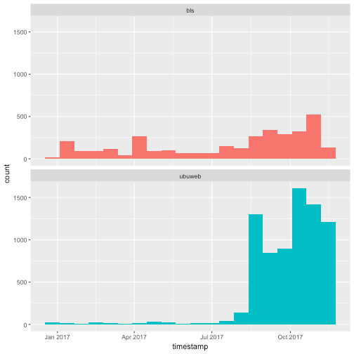
What does the British Library Sounds tweet volume look like compared to Ubuweb? The following examples borrow heavily from the Silge and Robinson chapter cited under Further Reading. They make use of functions that we won’t go into here, but I include them as examples of the kind of text analysis one can perform on the text of tweets. For more assistance with text analysis in R, please do consult the resources included under Further Reading.
# create subset for same time window in both datasets
bls_sample <- bls_dedup %>%
  filter(timestamp > as.POSIXlt("2017-01-01 00:00:00", tz="GMT"),
         timestamp < as.POSIXlt("2017-11-21 00:00:00", tz="GMT")) %>%
  select(text,timestamp,from_user)

ubu_sample <- ubu_dedup %>%
  filter(timestamp > as.POSIXlt("2017-01-01 00:00:00", tz="GMT"),
         timestamp < as.POSIXlt("2017-11-21 00:00:00", tz="GMT")) %>%
  select(text,timestamp,from_user)

# bind them together and plot histogram
tweets <- bind_rows(bls_sample %>%
                      mutate(dataset = "bls"), # add a column to identify the source of the tweets
                    ubu_sample %>%
                      mutate(dataset = "ubuweb")) # same

ggplot(tweets, aes(x = timestamp, fill = dataset)) + # color bars by source dataset
  geom_histogram(position = "identity", bins = 20, show.legend = FALSE) + # gather the timestamp values into 20 equal bins
  facet_wrap(~dataset, ncol = 1) # plot the bls and ubuweb tweets in two facets
Word frequencies
What was everybody talking about? Here, we’ll use the package tidytext to process the text of the tweets.
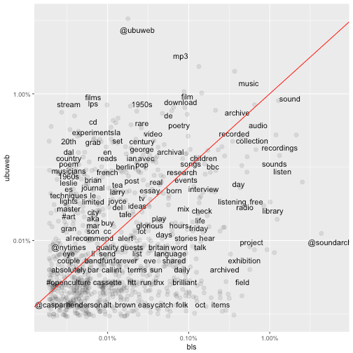
In the plot below, the terms that hover close to the reference line are used with about equal frequency by both the British Library Sounds and the Ubuweb tweets. The further away the terms are from the reference line, the more characteristic they are of the individual sound archive.
# install.packages("tidytext")
library(tidytext)
replace_reg <- "https://t.co/[A-Za-z\\d]+|http://[A-Za-z\\d]+|&|<|>|RT|https"
unnest_reg <- "([^A-Za-z_\\d#@']|'(?![A-Za-z_\\d#@]))"
tidy_tweets <- tweets %>%
mutate(text = str_replace_all(text, replace_reg, "")) %>%
unnest_tokens(word, text, token = "regex", pattern = unnest_reg) %>%
filter(!word %in% stop_words$word,
str_detect(word, "[a-z]"))
# calculate word frequencies for each dataset
frequency <- tidy_tweets %>%
group_by(dataset) %>%
count(word, sort = TRUE) %>%
left_join(tidy_tweets %>%
group_by(dataset) %>%
summarise(total = n())) %>%
mutate(freq = n/total)
frequency <- frequency %>%
select(dataset, word, freq) %>%
spread(dataset, freq) %>%
arrange(bls, ubuweb)
# install.packages("scales")
library(scales)
ggplot(frequency, aes(bls, ubuweb)) +
geom_jitter(alpha = 0.1, size = 2.5, width = 0.25, height = 0.25) +
geom_text(aes(label = word), check_overlap = TRUE, vjust = 1.5) +
scale_x_log10(labels = percent_format()) +
scale_y_log10(labels = percent_format()) +
geom_abline(color = "red")
Distinctive word usage
This example pulls the top 15 most distinctive words from the British Library Sounds and Ubuweb datasets and plots them as a bar plot.
library(knitr)

word_ratios <- tidy_tweets %>%
  filter(!str_detect(word, "^@")) %>% # drop replies
  count(word, dataset) %>%
  filter(sum(n) >= 10) %>%
  ungroup() %>%
  spread(dataset, n, fill = 0) %>%
  mutate_if(is.numeric, funs((. + 1) / sum(. + 1))) %>%
  mutate(logratio = log(bls / ubuweb)) %>%
  arrange(desc(logratio))

word_ratios %>%
  group_by(logratio < 0) %>%
  top_n(15, abs(logratio)) %>%
  ungroup() %>%
  mutate(word = reorder(word, logratio)) %>%
  ggplot(aes(word, logratio, fill = logratio < 0)) +
  geom_col() +
  coord_flip() +
  ylab("log odds ratio (BLS/Ubuweb)") +
  scale_fill_discrete(name = "", labels = c("BLS", "Ubuweb"))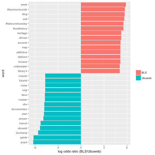
rtweet: A Brief Detour to Data Collection
Last week, we went over several tools for collecting social media data, but since we’re in the R environment, it makes sense to take a quick look at the rtweet package.
Install rtweet using the install.packages() function. Then load it in your session with library().
The first time you make an API request—e.g. search_tweets(), stream_tweets(), get_followers()—a browser window will open.
- Log in to your Twitter account.
- Agree/authorize the rtweet application.
- That’s it!
Follow the developer’s intro and package documentation for more ideas on how to use this tool.
install.packages("rtweet") # install rtweet from CRAN
library(rtweet) # load rtweet package

# search for 1000 tweets sent from New Brunswick, NJ
nb <- search_tweets(geocode = lookup_coords("new brunswick, nj"), n = 1000)
Kearney bundles a nice function for quickly visualizing your tweets as a time series plot. For help, and additional tips, type ?ts_plot() in the console.
What temporal patterns, if any, do you observe?
ts_plot(nb, by = "hours")Solutions
These are potential solutions to the questions raised in this worksheet.
# How would you select the Twitter user account names and their number of friends, and arrange them in descending order of friends?

bls_dedup %>%
  select(from_user, user_friends_count) %>%
  arrange(desc(user_friends_count)) %>% View
# Can we use `select()`, `group_by()`, `summarize()`, and `arrange()` to figure out how many tweets there are by user language?
library(stringr)
bls_dedup %>%
select(user_lang) %>%
group_by(str_to_lower(user_lang)) %>% # stringr's str_to_lower() converts to lowercase
summarize(n = n()) %>%
arrange(desc(n)) %>% View# How could we use the dplyr verbs we just learned to figure out which users have more followers than people they follow (a rough indicator of influence)? You might want to make use of some statistical summaries, like mean(), median(), min(), and max().
bls_dedup %>%
select(from_user, user_followers_count, user_friends_count) %>%
filter(user_followers_count > user_friends_count) %>%
mutate(surplus = user_followers_count - user_friends_count) %>%
group_by(from_user) %>%
summarize(max_followers = max(user_followers_count),
max_friends = max(user_friends_count),
max_surplus = max(surplus)) %>%
arrange(desc(max_surplus)) %>%
kable()# How can we modify the code above to return the top 10 Twitter account names that received direct replies in the dataset?
bls_dedup %>%
filter(!is.na(in_reply_to_user_id_str)) %>%
group_by(in_reply_to_screen_name) %>%
summarize(replies = n()) %>%
arrange(desc(replies)) %>%
top_n(10, replies) %>% ViewFurther Reading
Arnold, T. and L. Tilton, “Set-Up” and “A Short Introduction to R,” Humanities Data in R (Springer, 2015).
Heppler, J. and L. Mullen. R, Interactive Graphics, and Data Visualization for the Humanities. Workshop offered at Digital Humanties Summer Institute 2016, University of Victoria, Victoria, Canada. https://github.com/hepplerj/dhsi2016-visualization.
Mullen, L. Digital History Methods in R (2017).
Silge, J. and Robinson, D. “Case study: comparing Twitter archives”
Text Mining with R. (O’Reilly, 2017). http://tidytextmining.com/twitter.html.
Torfs, P. and C. Brauer, “A (very) short introduction to R” (2014).
Wickham, H. “Introduction,” R for Data Science (O’Reilly, 2016).