About this workshop
This is the text of a workshop that I (Francesca) led in Fall 2019 on how to analyze and view historical data in QGIS. I’ve posted previously about visualizing present-day New Jersey census data in QGIS. This version is adapts (er… steals, really) a tutorial written by Brandan P. Buck for the Mapping Early American Elections (MEAE) project. I’ve swapped Maryland for New Jersey, of course, and I chose to focus on a late eighteenth-century congressional election in which the beginning of the modern two-party system starts to emerge. It was written with beginners in mind and introduces some basic but powerful operations such as table joins and data classification.
Contents
About QGIS
QGIS is an advanced desktop mapping tool, comparable to ArcGIS. Its advantages: it is a strong tool for geospatial analysis; it’s easy to export your work to static images (PDF, TIFF, etc.). QGIS is less well suited for making interactive web maps, although there are various plugins (e.g. qgis2web) that facilitate this work. The downside of QGIS is that the learning curve can be steep.
In the hands-on portion of this workshop, we will use data from Mapping Early American Elections (MEAE) and boundaries from the Atlas of Historical County Boundaries to create a thematic map. We will go through the steps of a workflow to visualize percentages of votes in the 1798 U.S. House of Representatives election in New Jersey.
QGIS: A First Look
QGIS uses map layers. You might initially find it surprising that QGIS does not start with a base layer, like Google Maps. QGIS expects you to add every layer for yourself.
Getting Data
We will analyze and visualize MEAE data representing the election of two Federalists and three Democratic-Republicans to the 6th Congress. This is one of the first elections in which it is possible to observe the beginnings of a Democratic-Republican surge as voters in New Jersey reacted against the Alien and Sedition Acts, passed by a Federalist-dominated 5th Congress and signed into law by President John Adams in 1798.
The MEAE elections data we will use are structured as two separate .csv files, and are recorded at the county level.1 The file congressional-parties-meae.congressional.congress06.nj.county.csv records the number of votes and percentage of vote received by each political party in New Jersey’s then thirteen counties (one row for each county).2 The file congressional-candidate-counties-meae.congressional.congress06.nj.county.csv shows the number of votes each candidate received by New Jersey county (34 rows). These files are freely downloadable here and here, but to spare us some time hunting for the correct ones, I’ve copied the files to Box: https://rutgers.box.com/s/f1d88jp9yvrm4ynzc6n873n0mcu216dy.
Next, go to https://publications.newberry.org/ahcbp/pages/New_Jersey.html, scroll down to “Download Shapefiles for use with GIS Programs” and click the link to download the zip file. We will only use the NJ_Historical_Counties shapefile.
Once you’ve downloaded both datasets, you should unzip them into a directory on your Desktop (right click and select ‘Extract all’ on a PC).
Importing the MEAE Data
In QGIS, open a new project (Project > New).
Each dataset can be added to QGIS as a layer. The type of layer will depend on the kind of data that you are using. We will begin by adding the MEAE data for New Jersey. Since these are in comma-separated value files with no spatial data beyond a unique identifier for the county, they are considered a delimited text layer.
Add the two .csv files you’ve downloaded to your QGIS project by going to Layer > Add Layer > Add Delimited Text Layer. Select the “No Geometry (attribute only table)” box. Make sure to check the box next to “first record has field names.” Click Add, then Close.
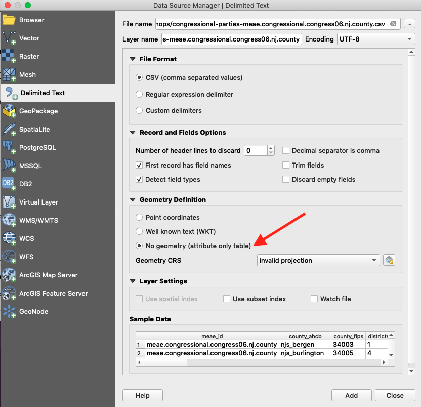
Now the elections return data will function as data layers within QGIS and appear within your Layers panel on the lower left side of your display.
Let’s take a closer look at both data objects to make sure that our data was read in correctly, and that we understand the different variables they contain. In your Layers panel, you should see the two .csv files you imported. The number of observations corresponds with the number of rows of data, while the number of variables corresponds to the number of columns in the data. congressional-candidate-counties-meae.congressional.congress06.nj.county.csv should have 34 rows and congressional-parties-meae.congressional.congress06.nj.county.csv should have 13. Right click on a .csv in your Layers Panel and select Open Attribute Table to inspect your data.
Let’s examine the data in the parties file. This data object contains data for the vote and percentage of the vote for all parties received in this election. The first variable (column) is called meae_id. This variable contains a unique name that identifies this election in the MEAE data. You will notice that all 13 rows have the same meae_id: meae.congressional.congress06.nj.county. This tells us that all the data here is county-level data from New Jersey’s Sixth U.S. Congressional election. The variables county_ahcb and county_fips each contain a unique identifier for each county. Notice that each row of data represents one of New Jersey’s then 13 counties. These variables will be necessary when we join the MEAE data to the spatial data.
Next, the variable districts gives us the number of the voting district into which New Jersey counties were organized. Notice that Middlesex, Essex, and Bergen were grouped together into a Northern (1) District. Finally, the last type of variable lists the total number of votes (federalist_vote) and percentage (federalist_percentage) of the vote achieved by each party or faction. In New Jersey’s sixth Congressional election, only the Federalist and Democratic-Republican parties received votes. If you scroll to the right, you will see variables for other parties and factions that did not participate in this election. The data for these variables should appear as “NA.”
Now, let’s have a look at the data in candidates file by clicking the data object’s name in the Layers panel. This is more of a reference dataset so you know who the candidates were; we won’t be creating visualizations using the candidates file. The last four variables in this dataset represent the candidates’ names, a unique identifier for each candidate, the party or faction the candidate represented in this election, and the number of votes the candidate received in the county listed in that row.
Importing the AHCB Data
Inside the NJ_AtlasHCB directory, you will find a folder named NJ_Historical_Counties which contains the shapefile we will use. You only need to load the .shp file. Even though the shapefile actually has several different files associated with it, you add it as a file and not as a directory. QGIS automatically imports the associated files. Drag and drop the .shp file component into your QGIS Layers panel or add it via QGIS menu Layer > Add Layer > Add Vector Layer.
Right click on your newly imported boundary shapefile and select “Open Attribute Table.” Compare the observations in these columns to those in either of the MEAE data objects. The observations they contain should look familiar. The data in the new variable name matches the data for the variable county in the MEAE data; the new variable id matches the data from county_ahcb; the data in fips matches that in county_fips and so on. Having data that is common between our MEAE data and the spatial data will be key in joining the data together later on.
Next, you’ll see variables for start_date, end_date, change, and citation. The start_date and end_date show the date range for which the data provided is accurate.
Let’s extract just the boundary data that we will need. For the 6th Congress, we need New Jersey county boundaries circa January 1798. The easiest way to select the appropriate boundary data will be via an SQL query.
Select the NJ_Historical_Counties shapefile in your Layers panel. Right click and select Filter. Enter the following SQL query:
'START_DATE' < '1798-01-01' AND 'END_DATE' > '1798-01-01'
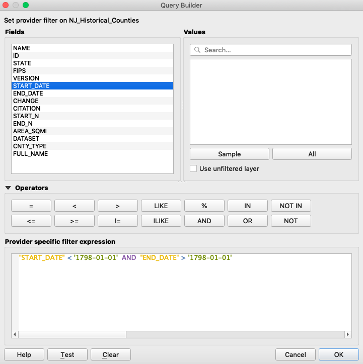
You should have 13 returns.
Right click on NJ_Historical_Counties and select Export > Save Features As > ESRI Shapefile. Choose an appropriate file location and name, e.g. nj_historical_counties_1798. Click OK.
Import your new shapefile into QGIS either by dragging and dropping the .shp file or via the Layer > Add Layer > Add Vector Layer menu.
Now you have New Jersey county boundary data from 1798, the year of the 6th congressional election.
There are a number of things you can do now that QGIS is displaying data. You can pan and zoom using the tools in the tool bar. It is particularly useful to right click on the layer in the list of layers to the left and choose “Zoom to layer.” Using the “Identify Features” tool under the View menu, you can click on individual counties and see the data associated with them.
You may also want to turn on labels for your shapefile. Right click on the layer, select “Properties > Labels”. In the top drop down menu, select “Show labels for this layer”. In the second drop down menu, select “NAME” as the field that contains your labels. Click “OK”.
Joining Data
In order to make the desired maps, you will need to join the 6th New Jersey Congressional elections data to your newly created 1798 boundary data. To do so you will tell QGIS to join data from the former onto the latter using a shared field. This field is referred to by slightly different naming conventions so you will need instruct QGIS as to which two fields are the same.
Right click on the Properties function of your 1798 county shapefile.
Select the “Joins” tab on the left side of the panel.
Select the + function on the bottom of the window. Choose your party election returns .csv from the layer dropdown window.
Choose county_fips as the Join field and FIPS as the Target field.
For simplicity, you may want to join only the needed information from our election data. Under “Joined Fields” select federalist_vote, federalist_percentage, demrep_vote and demrep_percentage. Your appended sections data will appear at the end of the 1798 New Jersey county shapefile.
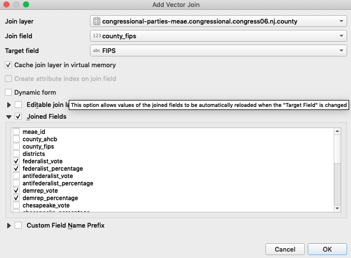
Once we have completed the join, we can reopen the shapefile’s attribute table. Now we should have access to the columns we selected from the CSV file.
Visualizing Party Percentages
Since you joined the elections return data to your spatial data you can now use QGIS to symbolize the county polygons according to the election returns. To do so, we will use the graduated function to create a Choropleth map.
Right click on your 1798 shapefile and go to “Properties > Symbology”. Select “Graduated” and then the federalist_percentage column in the dropdown menus. Click the “Classify” function below the display window. Select “Natural Breaks (Jenks)” for the “Mode.”
Choose a color scale which is aesthetically pleasing and conveys the historical information you desire for your map. For this tutorial you will use a color ramp with three classes in order to concentrate the Federalist’s wins in the center and south of the state. To do this select 3 from the “classes” drop down menu on the right side of the window. Different election results will demand a more nuanced color scale.
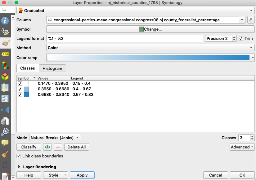
Click Apply, then OK.
You can save the map by going to Import/Export > Export Map to Image. Your result should look similar to Figure 5.
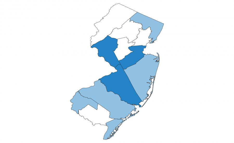
To create a map for the Democratic-Republican returns, repeat step one but change demrep_percentage to your input. You might try a 5-class Jenks classification to get a bit more nuance with this party’s returns. Save the map as an image as you did before. Your result should look similar to Figure 6.
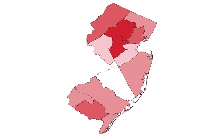
Now you have maps for both the Federalist and Democratic-Republican party results for the 6th New Jersey Congressional election.
At this point, you could create a hover effect so that the user can see the raw vote count for each party. Right click on your 1798 shapefile and go to Properties > Display. In the HTML Map Tip window, copy this markup.5
<b>County: </b> [% "NAME" %]
<br>
<b>Federalist vote: </b> [% "congressional-parties-meae.congressional.congress06.nj.county_federalist_vote" %]
<br>
<b>Democratic-Republican vote: </b> [% "congressional-parties-meae.congressional.congress06.nj.county_demrep_vote" %]
Bivariate Choropleth Maps
Let’s try making a bivariate (two variable) choropleth maps to see both the federalist and the democratic-republican percentages at the same time. This is going to get a bit hand-wavey; I will direct you to a blog post by Joshua Stevens on the reasons for creating a matrix of two related, classified variables.3 We will start with the Federalist and Democratic-Republican vote percentages, each split into five classes using the Jenks algorithm, to create a 25-class merged variable.
| D-R→ | 0-17% | 17-28% | 28-44% | 44-72% | 72-85% | |
|---|---|---|---|---|---|---|
| F↓ | A | B | C | D | E | |
| 0-21% | 1 | A1 | B1 | C1 | D1 | E1 |
| 21-40% | 2 | A2 | B2 | C2 | D2 | E2 |
| 40-63% | 3 | A3 | B3 | C3 | D3 | E3 |
| 63-74% | 4 | A4 | B4 | C4 | D4 | E4 |
| 74-83% | 5 | A5 | B5 | C5 | D5 | E5 |
We’ll begin by creating two new variables in the attribute table of our 1798 county boundary shapefile. Open the attribute table of the shapefile. Press the “New field” button at the top. Let’s call this first variable Fed_Class for the five classes of Federalist vote percentages. In the “New field” pop-up window, indicate that this is a variable of type “Integer” with a “Length” of 1.
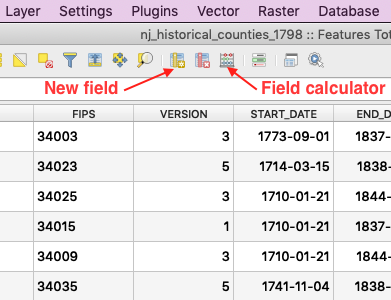
Then, still in the attribute table, use the dropdown menu in the upper left to select your new Fed_Class variable. Click the epsilon (ε). In the Expression window that pops up, enter the following SQL. What this does is assign a class of 1 through 5 for the Jenks breaks we created earlier using the Symbology panel. Click OK.
CASE WHEN  "congressional-parties-meae.congressional.congress06.nj.county_federalist_percentage" > 0.736 THEN 5
    WHEN "congressional-parties-meae.congressional.congress06.nj.county_federalist_percentage" <= 0.736 AND "congressional-parties-meae.congressional.congress06.nj.county_federalist_percentage" > 0.631 THEN 4
    WHEN "congressional-parties-meae.congressional.congress06.nj.county_federalist_percentage" <= 0.631 AND "congressional-parties-meae.congressional.congress06.nj.county_federalist_percentage" > 0.395 THEN 3
    WHEN "congressional-parties-meae.congressional.congress06.nj.county_federalist_percentage" <= 0.395 AND "congressional-parties-meae.congressional.congress06.nj.county_federalist_percentage" > 0.205 THEN 2
    ELSE 1
END
Back in the attribute table, press “Update All” to apply the expression and populate the values of the new Fed_Class column.4
Let’s repeat this for the Democratic-Republican vote percentages. Use the “New field” button to create a second DR_Class variable for the democratic-republican data. This variable will be of type “Text” with a length of 1. Copy this text into the Expression editor and then select “Update All.”
CASE WHEN "congressional-parties-meae.congressional.congress06.nj.county_demrep_percentage" > 0.723 THEN 'E'
    WHEN "congressional-parties-meae.congressional.congress06.nj.county_demrep_percentage" <= 0.723 AND "congressional-parties-meae.congressional.congress06.nj.county_demrep_percentage" > 0.435 THEN 'D'
    WHEN "congressional-parties-meae.congressional.congress06.nj.county_demrep_percentage" <= 0.435 AND "congressional-parties-meae.congressional.congress06.nj.county_demrep_percentage" > 0.279 THEN 'C'
    WHEN "congressional-parties-meae.congressional.congress06.nj.county_demrep_percentage" <= 0.279 AND "congressional-parties-meae.congressional.congress06.nj.county_demrep_percentage" > 0.166 THEN 'B'
    ELSE 'A'
END
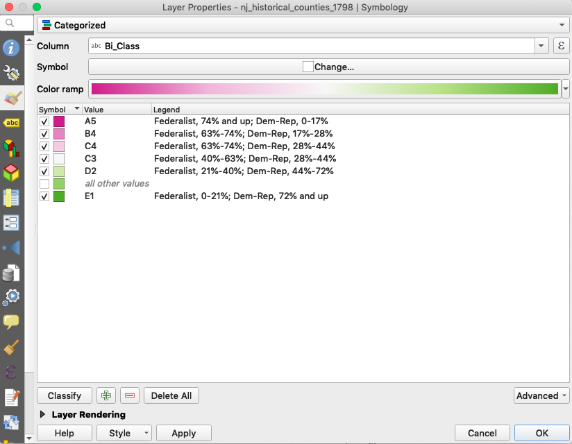
Next, we need to combine those two new columns into a third, called Bi_Class. Create a third and last field for Bi_Class (type “text”, length 2). Enter the expression below to concatenate the values from the Fed_Class and DR_Class columns.
concat("DR_Class",tostring("Fed_Class"))
Finally, let’s symbolize the map as a categorized choropleth using Bi_Class as the data column. We can compare it for reference to the one published on the Mapping Early American Elections site: http://earlyamericanelections.org/maps/meae.congressional.congress06.nj.county.html.
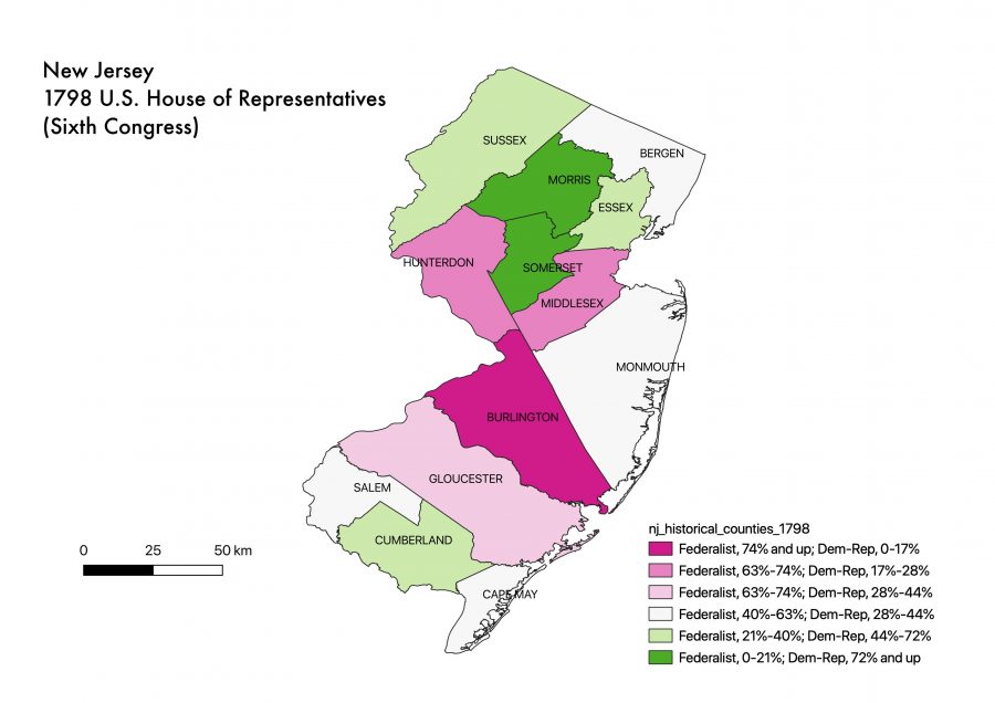
Discussion
What criticisms would you make of the maps you have created? What are their strengths and weaknesses?
Will you potentially be able to use anything covered today in your work? What didn’t we cover that you were hoping to learn?
Print Composer
We might not get to create a print-ready map during today’s workshop, but Maala Jhagra has prepared a short and to-the-point YouTube video on how to export high resolution maps with legends and scale bars. See https://youtu.be/OtVpOzLA_NM
Historic Maps
We did not cover georeferencing of historic maps in today’s workshop, but this will be the subject of a subsequent workshop, Georeferencing Historical Maps in QGIS, on October 16 and 22. Please join us! More at https://dh.rutgers.edu/fall-2019-events/.
References and Further Reading
Bodenhamer, D. J., Corrigan, J. and Harris, T. M. 2010. The Spatial Humanities: GIS and the Future of Humanities Scholarship. Bloomington: Indiana University Press.
Guldi, J. 2011. “What Is the Spatial Turn?” Spatial Humanities: A Project of the Institute for Enabling Geospatial Scholarship. http://spatial.scholarslab.org/spatial-turn/the-spatial-turn-in-history/index.html.
Buck, B. P. 2019. “QGIS Tutorial”.*
* This handout borrows a great deal from Brandan Buck’s tutorial.
- It is worth noting that township-level data are available at A New Nation Votes: American Election Returns 1787-1825. See, for example, Middlesex County at https://elections.lib.tufts.edu/catalog/9k41zf79q. ↩
- The election results were in fact organized according to a district system, e.g. Eastern, Northern, Western, Middle, and Southern. ↩
- https://www.joshuastevens.net/cartography/make-a-bivariate-choropleth-map/ ↩
- Reading others’ instructions on how to do this, I became aware that my field calculator was not working as expected. Other users were able to use the field calculator to create the new column (variable) and apply the expression to populate its values all in one step. Fortunately, there is another way, which I describe here. I chalk this up to the vagaries of using open source software. For the record, I created this workshop on Mac OS 10.14.6 using QGIS 3.6.0-Noosa. ↩
- All of these snippets of HTML markup and SQL code get cut off in the PDF of this handout. For copy/pasting purposes, I recommend using the markdown (.md) version, which I have also given you. It’s a text file that will open in TextEdit (Mac) or Notepad (PC). ↩
