
by Caterina Agostini and Francesca Giannetti
Introduction
Earlier this year, Rutgers was invited to become a participant in the beta evaluation of ITHAKA JSTOR’s Constellate, a text analysis and pedagogy platform. As a result, we have had early view into a rapidly evolving service that aims to advance text analytics pedagogy. While pedagogy is its main thrust at the moment, Constellate is a fairly complex offering that is structured around three “pillars”: data, pedagogy, and research.
For readers who are familiar with JSTOR’s Data for Research (DfR) program, which has provided researchers with bibliographic metadata, unigrams, bigrams, and trigrams for JSTOR journals and books since 2010, Constellate offers all that and then some. In addition to the secondary literature provided through JSTOR, data sources also include Portico and the Covid-19 Open Research Dataset (CORD-19), primary sources from Reveal Digital and DocSouth, as well as American newspapers from Chronicling America. Data include the bibliographic metadata for all documents, and full text for pre-1924, out-of-copyright works. It is possible and easy to download datasets for use in one’s own custom analysis environment. Datasets in CSV format of bibliographic data are capped at 25,000 items, or 50,000 for beta participants, within the Constellate dataset builder. Rutgers–New Brunswick is a beta participant, so gather ye data, and so forth.1 The Constellate people have also made it relatively straightforward to use your own code by supporting connections from the dashboard to a GitHub repository or online notebook of your choosing. The data available to users in Constellate does not depend on your institutional access to JSTOR. In this they are similar to the HathiTrust Research Center where access to data is not predicated upon membership in the HathiTrust Digital Library. Although a subscription tier is probably in the works for Constellate further down the road.
As for their extensive pedagogical materials, the Constellate folks have created a cloud environment for teaching with Jupyter Notebooks. If you haven’t already encountered a Jupyter Notebook, they are a semi-ubiquitous tool of the data science trade where explanatory text, code, and visualizations can live together in the same document and be presented interactively on the web. One of their main advantages, when backed by Binder or similar, is a controlled computing environment that removes the need to install a bunch of open source software on one’s personal machine. This is great for introductions to text analysis, where instructors want to keep the focus on the methods as opposed to time-greedy software installations. At the moment of writing, Constellate has 27 notebooks and counting, covering beginner, intermediate and advanced topics, all written in Python by a range of experts (R lessons are on the horizon). The notebooks are well commented and easy to follow along. A default dataset (Shakespeare Quarterly, 1950-present) is included for analysis examples, but substituting one’s own dataset ID is an excellent way to familiarize oneself with the Jupyter Notebook environment and with editing and altering the code.
However, even if one desires never to see a line of Python, it is possible to get quite a lot of mileage out of the experience of using Constellate in the classroom. Read on for an introduction to the platform and its dataset builder.
Getting Started
Logging into Constellate is not strictly required to get started, but to identify yourself as a member of a beta testing institution and to save your datasets and dashboard, you will be required to authenticate your connection.2 The login step is a little confusing at first, since they prompt you both to “[l]og in through your institution” in the upper right, and to register a personal account (Google logins are supported). The former is to identify yourself as an affiliate of a beta testing institution (which Rutgers is), the latter credential is to save your dashboard and datasets to the Constellate database (it also works as a personal account over at https://www.jstor.org/). Once you log in with your Rutgers netID credentials, you will see “Access provided by Rutgers University, New Brunswick” in the upper right corner. And when you log into JSTOR with your personal account, a blue button in the upper right of the dashboard will allow you to “Log Out” when done.
Building a Dataset
Now that this step is done, let’s take a look at the dataset builder.
To start, we will explore available, pre-built datasets on Constellate.
In their Introduction to Text Analytics class, the examples discussed included academic journals, underground newspapers, and the themes of gender and feminism.3
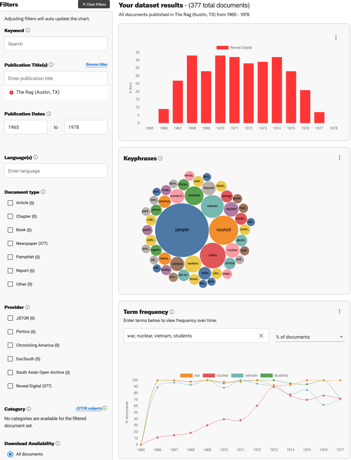
For example, we searched The Rag (Austin, TX), an underground newspaper printed between 1966 and 1977. Here are the results of this periodical title search (“all documents”):
- A bar graph showing the distribution of the number of documents across two decades.
- Key phrases (unigrams, bigrams, or trigrams), extracted through a tokenization process, reveal the main concepts in the text collection.
- Term frequency.
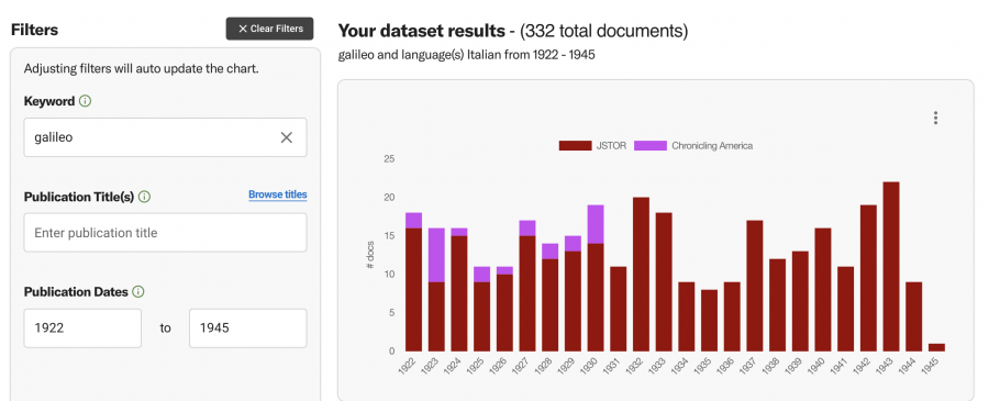
Now, let’s see how we can build datasets with content from JSTOR, Portico, and other sources. Caterina was interested to find out more about text analytics on Constellate relating to the work of Galileo Galilei. First, she started with a general query and entered “Galileo” as a keyword, which generated approximately 90,000 results ranging from all sources in the Constellate collections, from 1900 to 2021.
Next, she narrowed down the search, entering Publication Dates between 1922 and 1945, in addition to filtering for Italian language materials only. The rationale behind this search is an interest to probe and explore the decades when Fascism encouraged nationalistic propaganda. In those years, scholars were encouraged to revive studies and comparisons with earlier Italian scholars and scientists, and the purpose was propaganda—as historical evidence of a supposed Italian character and genius that the political regime promoted.
As a result of that search, the Constellate-generated dataset shows 322 total documents, the majority of which comes from JSTOR, with a few originating from Italian language newspapers in Chronicling America.
Digging Deeper
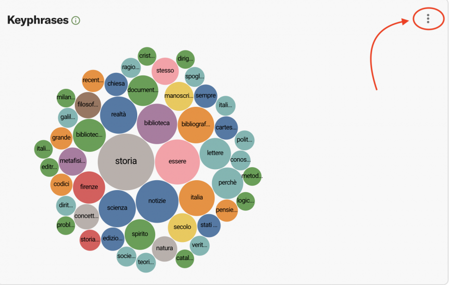
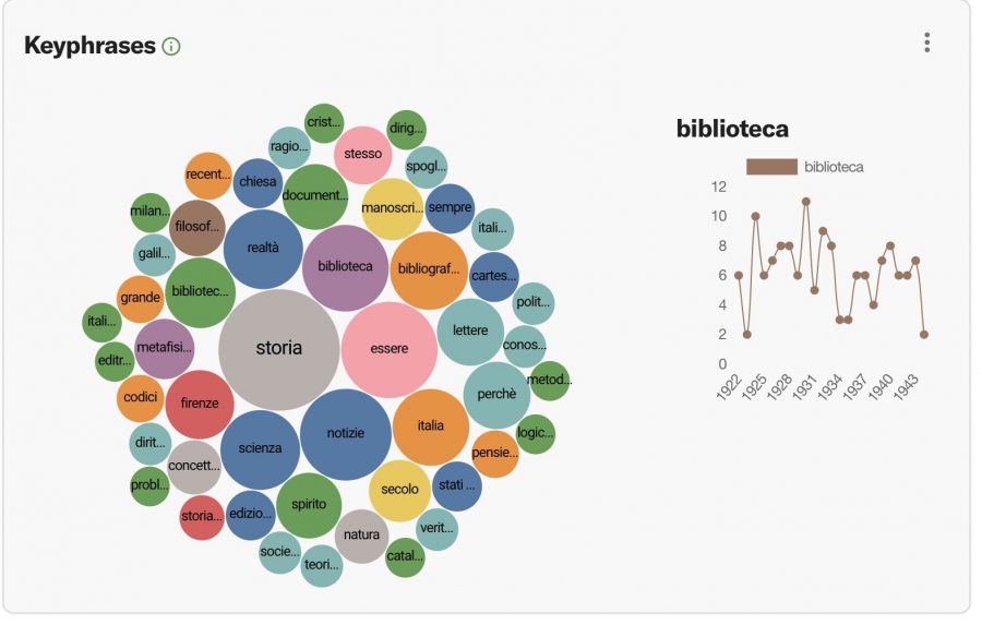
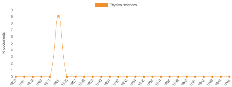
How can we interpret some aspects of the visualizations produced by Constellate? For the Galileo-related dataset that Caterina built, the dashboard visualizations include key phrases, term frequencies, document categories over time, and a category tree map. In this specific case, all visualizations provided a different perspective. One overarching impression, however, is that something stands out in the years between 1924 and 1926, a time period that is significant since it coincides with the 1924 Italian general election.
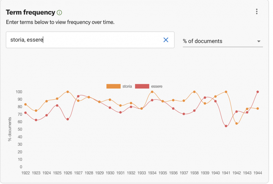
For all visualizations, users can see a vertical ellipsis in the upper right corner. Clicking on that icon produces a menu that allows you to save the graph, download the list as a comma-separated value file (.csv), or share the visualization online by obtaining a shareable link. Ngrams are visualized in two ways, first as a bubble plot and second as a time series plot. Two of the most frequent keyphrases in the bubble plot are the words “storia” (“history”) and “essere” (“being,” or “to be”).
In the bubble plot, you can click on any word, for example “biblioteca” (“library”), and a smaller time series plot will appear on the right, visualizing the relative frequency of the word within the dataset. Note that there’s been no lemmatization done for these exploratory visualizations, so we have both “biblioteca” and “biblioteche” appearing in the plot.
Next, the time series plot shows term frequencies across the selected timespan (in this case, we have entered “storia” and “essere”). That combination can easily be modified, adding up to four words at a time. Caterina also tried “biblioteca” (“library”) and “Firenze” (“Florence”), to which she later added “natura” (“nature”). When entering terms to view frequency over time, separate each word with a comma. Additionally, we can alternate between percentage of documents and total documents.
Furthermore, at the bottom of the dataset builder page, you can also browse through the documents in your dataset. So, you can explore both the sources produced by your search as well as their resulting visualizations.
The Document categories over time graph shows a single spike in between 1924 and 1926, as noticed in previous data visualizations. What this graph adds, is that the contribution comes from one scholarly study, and that it was in the field of Physical sciences (other documents in this small dataset evidently do not carry subject classification). One last visualization is the category tree map, which, at least in this case, does not yield meaningful insights into the dataset.
There is always a way to revisit and refine your Constellate dataset, and thus update the dataset builder visualizations accordingly. Furthermore, all data visualization types have an info button on the right, which reveals a concise definition of the visualization type and function.
Getting Help
Caterina and Francesca both attended sessions from Constellate’s Introduction to Text Analysis course in May 2021. These sessions drew their material from the Jupypter Notebooks available on the site. The New Brunswick Libraries will trial workshops inspired by these offerings in Spring 2022.
The Text Analysis Pedagogy Institute, affiliated with Constellate, offers free, online courses in text analysis. The TAP Institute is open to all teachers (and aspiring teachers) of text analysis. Stay tuned for a 2022 institute in partnership with the University of Arizona.
Constellate offers an email group and a Slack channel for beta participants as a way to get help and ask technical or research-based questions relating to the service. Amy Kirschhoff, Constellate Text Analytics Business Manager, may be contacted for a Slack invitation (be sure to mention your current Rutgers affiliation).
Last and not least, Constellate’s documentation is thorough and growing more so all the time. Check there first for answers to your questions.
- See https://constellate.org/docs/dataset-options for more. ↩
- Dropping keywords into the search box and fiddling with the filters does not require a login: https://constellate.org/news/user-quick-start. ↩
- For a good overview of the underground newspaper collection of Reveal Digital, see Jeremy Guida, “How Women Fought Misogyny in the Underground Press,” JSTOR Daily (blog), July 11, 2021, https://daily.jstor.org/how-women-fought-misogyny-in-the-underground-press/. ↩